Wednesday 13 February 2013

EVALUATION: How does your media represent particular social groups?

How does your media represent particular social groups?


A social group is a group of people who share the same interests. The social groups i represent are people interested in the best of british music past and present, the sterotypical groups they could be range from mods to indie kids. Above are 3 examples from tv shows/films in which my magazine social group would fit into. Programme one is my mad fat diary - its based on a 16 year old girl called Rae who is a mad oasis fan (in the still shot i selected from an episode her and 'the gang' are going to Knebworth to see them) the soundtrack to the show is mostly british artists too, heavily featuring the stone roses. In the second image it is from a short film called Spike Island its is about a rising indie band who travel to spike isalnd in may 1990 to see the stone roses. On the third image it is taken from 500 days of summer, the two people in this still shot are american however during the film they talk about their love of the smiths, in the particular scene in the photo they are at the record shop discussing the beatles. The ages of these actors are 26 so its shows how my magazine can branch out to older people too. 

My media magazine represents my social group by all the artists featured on the front:
amy winehouse, arctic monkeys, florence and the machine, the wombats, alt j, blur, ellie goulding, oasis, foals, U2, david bowie, ed sheeran, jamie t, two door cinema club, the libertines and the vaccines. The list of people clearly signifies what genre is inside, as if it was a pop magazine completely different acts would be on the front such as one direction or the wanted. The masthead meaning again represents the group as whenever anybody sings the national anthem they are represnting great britain and the people of it. The tagline best of british also directs at them because they are british so they will feel proud of the british musicians. 


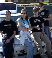
The clothes i have selected my models to wear in my photos also  represent my particular social group, my main cover star Aidan is wearing typical 'indie' clothes with a plaid shirt and smart coat. With Darius he is wearing casual everyday clothes so the readers and males of the social group can relate to him. I also featured a picture of me and my friend from a party, this will allow the girls to relate by dressing up in nice clothes so my social groups can relate by the reflection of themselves.

Through my article the reader is represented by the interviewer asking questions that they would want to know about the artist such as personal information like superstitions aswell as important music info such as upcoming tours which will excite them/appeal to them. The questions are chatty and informal which if the reader met the act themselves they would not be formal and posh to them so it represents their voice.

Monday 11 February 2013

EVALUATION - Who would be the audience for your media product?

My target audience for my music media product would be for males and females aged 15-35. It is slightly more directed at males with a ratio 60:40 i have tried not to limit my age range as my main genre is british music and british music has been iconic for decades therefore my magazine will feature older acts who will appeal to older audiences. i feel that 15-35 is a good range my magazine isnt't one that limits the reader by age but who the music will appeal to. The acts i will include will be from present day to older stars so that it gives the oppurtunity for the younger readers to find out about who their mom or dad listened to when they were younger or that the older end of the audience can learn about present day and future british musical icons. With music these days being different to what it used to be it gives a variety of acts however it is more indie musicans rather than pop. 

To see if my magazine worked within these age ranges i printed out/ using modern technology tweeted out copies/links to my magazine front cover, contents page and double page spread and asked for their opinions.

Here are the results:

21 year old male - 'This magazine is brilliant, it looks really professional and all the artists featured in are what's on my ipod, the main story was great as i could relate to aidan as i myself am trying to get into the music business'

40 year old man - 'Who are the vaccines? I've never heard of them, besides that the front image really caught my eye and made me want to read what was inside, the tagline sold the magazine to me as british music really is the best and i was pleased to see my favourite band the stone roses inside'

18 year old male - ' i would definetly buy this magazine if it were avaliable, i loved the idea of being able to have a digital copy aswell as im still at uni and i couldnt be dealing with magazines lying around everywhere'

12 year old female - "I liked the colours used and i found the interview funny, however i'd like to see one direction in there as they are the biggest british band at the moment"

29 year old - 'some great bands in there like oasis who i loved growing up, it was good to see them in there as music nowadays is just not the same although i do like that jake bugg fella'

From the feedback recieved it shows that 15-35 is a suitable age range.

Friday 8 February 2013

EVALUATION: Looking back at your preliminary task, what do you feelyou have learnt in the progression from it to its full product/

Masthead Progression:


Photography and cropping:
 Even from this far out you can clearly see which image is the clearest, when zooming in further the quality is lost from the left preliminary image becoming blurry and pixelated whereas the right hand image stays fully in focus. During the progression i learnt that i needed to improve on the quality by taking a closer shot, getting a better camera, improving the background so that it could easily be removed and improve the lightning all of which i think i have done.

My cropping standard from preliminary to music task has greatly improved, on my school magazine cover the crop is rough and ugly whereas above you can clearly see straight cut edges and the background easy to change to whatever is desired.

Typography:
In my school magazine numerous fonts were used which looked a bit 'mish mash' and didnt fit in well or compliment each other. For my music task i used a total of 3 fonts altogether throughout my 4 pages produced, this kept the house style consistent and instantly recognisable to my magazine. It also fitted in well with the target audience, it was easy to read and simple therefore appealing to all my age range (not being too child like) and it kept it professional.


Conventions:
In my preliminary task i didnt include key conventions such as price, also i just seemed to stick the bar code in the top left hand corner - a location it never goes in - and it makes it look really out of place. There is little anchorage text or snippets to what is inside on my school cover and it only gives you 3 pieces of information on what you can find inside. On my music magazine cover loads of bands/musicians are listed to give the reader an idea of what is inside, also free posters are offered as well as news on T in the Park festival and my main cover story. 

For my school contents page the layout is boring and follows a classic way of contents pages whereas for my music contents i have broken boundaries and chose a unique design layout with plenty of images and less text this makes my magazine more unique and recognisable and shows how i have developed to be able to create new ideas to use. In my school magazine i have missed out key details such as web adress of issue number which are classic conventions of magazine, i have ensured that all these features go in my music magazine.

Wednesday 6 February 2013

EVALUATION: What have you learnt about technologies from the process of constructing this product?

In my preliminary task i had no eperience using software such as photoshop therefore i opted for the easier way by using paint to crop my images, as you can see looking back my crop was rough and my picture was unfocused. Now with my music magazine photo you can see the difference in how smooth and clear my cropping and photography is. I have learnt that the main image is one of the most important things on the cover therefore i have greatly improved on this whilst my knowledge and ability has grown too. 


I also learnt on microsoft publisher how to remove the background (set trandsparent) and how to alter the brightness and contrast of images using the picture toolbar. There was also a useful cropping tool which helped me manipulate my images to the size/amount that i wanted them to be.


In my preliminary task i used a camera from school in the media department, the cameras are good however they are not amazing. For my music task i used a panasonic lumix camera which is 14 megapixels. This made my image a lot better and still unpixelated even when 100% zoomed in on publisher, this made my final image look more professional and something you would see in a real magazine.


Through documenting my prodcution and progression on this blog i have used a number of different media to display it. when showing the development of my contents page i filmed a video on my ipad of me explaining the steps i then used this technology to upload it onto the video sharing site youtube. 

Other new media that i had not previously used before this task was slideshare, this is a website that posts powerpoint productions. Another new site i had used was prezi this was a bit like a powerpoint however more interactive and moves in a different way between slides. 


Another new piece of technology i used was a fish eye camera lens. A fisheye lens is an ultra wide-angle lens that produces strong visual distortion intended to create a wide panoramic or hemispherical image (from wikipedia). I used this to create a small image i would feature on my contents page for aidan's album cover entitled goldfish bowl. I decided to use this piece of equipment as the fish eye effect and the sphericalness would look like aidan was in a fish bowl metaphorically. Although this is only a small feature of the page it shows the detail i put in trying to get the content right and also to help me develop my skills. 

Here is what a common fish eye lens looks like and my distorted fish eye album cover:


Monday 4 February 2013

EVALUATION: In what ways does your media product use, develop or challenge forms and conventions of real media products?

Double page spread:
As i said back in my research of double page spreads, you can get different types - i chose a question and answer interview style article. Therefore following typical conventions of this i had the questions in a different colour to distinguish who was the interviewer/interviewee.


I have also included a bold heading, this is usually the main stand out thing along with the image therefore has to be big. On my magazine it takes up the whole width of one page plus overlaps onto the second page, i have chosen a white font on black background to make it really bold and seperate from the image/rest of article. This house style of black and white links back to the contents page where the masthead was white on black. Also in magazine double page spreads there is always a sentence under the heading to sum up the article which i have included.

Other features i have kept with:
- mode of adress being chatty and informal, sometimes humorous
- when interviewing a musician having a plug of theres at the end, here i have plugged aidans solo tour plans and debut album even mentioning to buy it on itunes/music stores at the end.
- consistent page number/masthead in the bottom corner
- quote overlapping the main image
- the main image taking up the majority of a whole page


EVALUATION: In what ways does your media product use, develop or challenge forms and conventions of real media products?

Contents Page:
One of the first things i laid down on my contents page was the masthead and 'This Month' this is a typical convention on contents pages to include the masthead and then a few following words usually 'contents', 'this week/month' or 'inside'. 
My version ------> 

Existing examples:
This feature is usually at the top of the contents page which i have stuck to.

Images:
On contents pages lots of images are usually found typically at least 2, on my contents page i have tried to be very visual and challenge this convention therefore usuing 6 original images taken by me. Here are 2 examples of magazines contents pages, one features only 2 images whilst the other has 5, next to them is my version with 6.


 Other common features:
Also on my cotents page i have featured many common conventions such as issue number, web address, the date(in my case month) and again the repeatition of the tagline. For where my features are displayed i have used 3 subtitles - news, reviews and monthly. I think the rhyme of news and reviews goes well, along with the catchiness of ready set stage also on my contents page. I have been challenging with my contents as there is little writing compared to most and it is mainly taken up by images. Subtitles are often used in contents page to categorise/break up the content.

On some contents pages it offers a subscribe today section (see below)
This is a feature which is not as common in magazines so i only used it briefly in my magazine to fill up a gap however it is still a regular feature in magazines like kerrang. On the examples to the left it is in quite a lot of detail about pricing and telephone numbers however i only mentioned 'subscribe today'.


However i challenged myself further by including a digital copy feature on the contents page. After much research i have still not found a single contents page which features a QR code digital copy feature. After scouring many copies and the internet i have saw QR codes on double page spread features offering information about singles but never on the contents. This pushed my creative skills and i think it makes my magazine really unique and offers a different viewing method for the reader. It is me challenging typical conventions of magazines however it this case i am creating a unique convention which i could see used in the future as more digital copies are becoming avaliable e.g. newspapers.


EVALUATION: In what ways does your media product use, develop or challenge forms and conventions of real media products?

My magazine front cover follows many of the typical conventions of magazines:

Masthead:
My masthead is a simple clear professional design, nothing to fancy to ensure that it doesn't attract the attention away from the front cover content. It has a professional feel to it and appeals to the whole age range of my target audience which is 15-35, if the typography used was too bubbly it would look like it belonged in a pop magazine so i think the font was just right.
Front Cover Image:
My front cover image is a medium close up taking up the whole length of my magazine, it was taken my a high pixel camera so the quality of it is very good and clear to mantain the professional feel. It is fully in focus and my model is showing a stern blank pose which is typical in many magazines, he is making direct eye contact with the camera so it feels more personal to the reader that he is looking directly at them.


Tagline, skybar, date, puff:
As my magazine is a montly magazine the date is classed as november, as people grow familiar with my product they will realise it is a monthly edition, this easily enables viewers to quickly see if the magazine is the latest issue or is out of date etc.

Barcode, price, selling points: 
Here you can see in the bottom right corner the barcode and price of my magazine. There is also a bottom bar full of other artists who feature inside this attracts the reader into wanting to know whats inside. The use of the word plus followed by a list of content is often used on front cover. Here are examples of the features i have just mentioned on other front covers to show that they are conventions of real products.